Well crafted
A Starbucks store often housed a riot of promotional messages and colors. To return to the brand’s roots as the original premium coffeehouse, we created a visual vocabulary that featured a refined palette and hand-touched details.
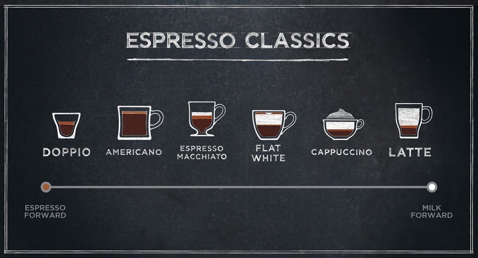
Signage for core coffee drinks suggested a classic coffeehouse chalkboard, with a focus on coffee expertise.
Food packaging echoed the chalkboard graphics, with expressive hand -drawn graphics.
Baristas were given chalkboards and designs to execute at point of sale.


